Karachi, Pakistan
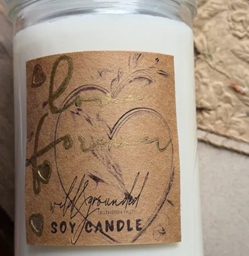
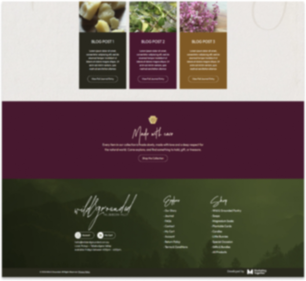
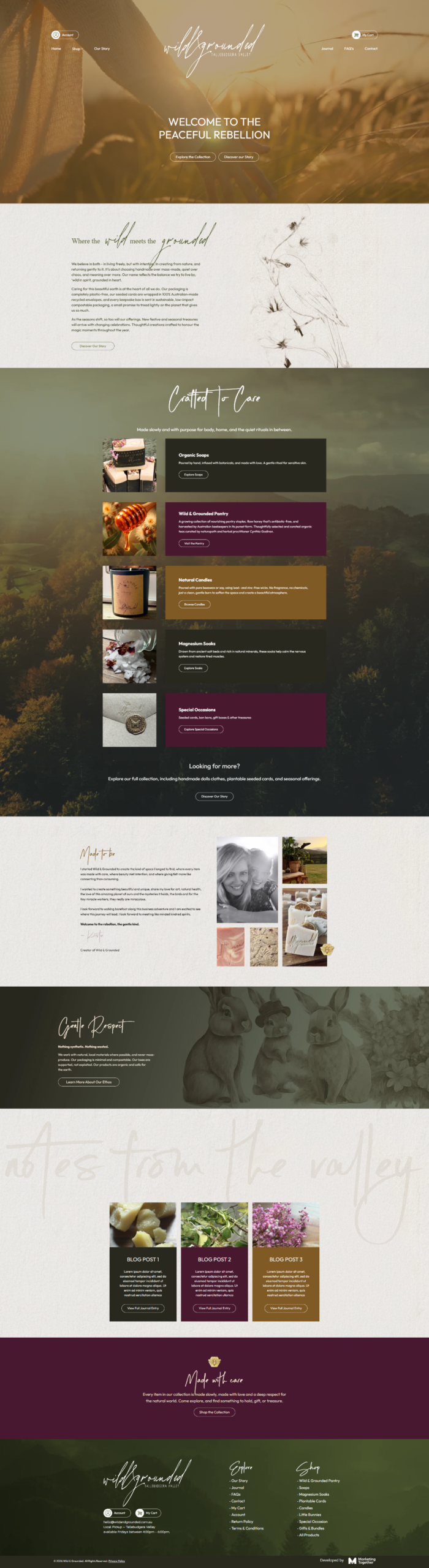
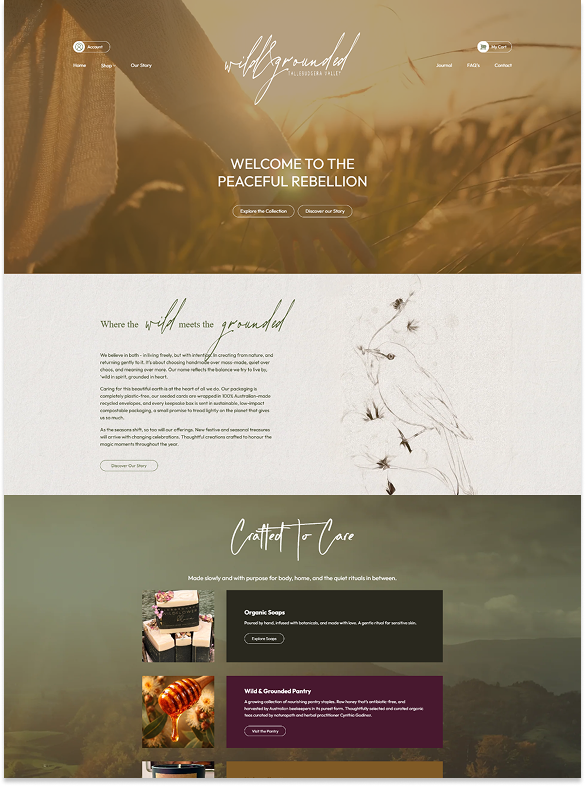
This homepage is designed with a storytelling-first approach that blends brand emotion with guided product discovery. A strong hero section immediately sets the tone with nature-led visuals and a clear value proposition, supported by dual CTAs to capture both exploratory and ready-to-buy users. The flow transitions smoothly into a brand narrative section, building connection and trust before introducing products. Category highlights are structured to showcase key offerings while maintaining a calm, premium feel. Product blocks use rich imagery and subtle contrast to draw attention without overwhelming the layout. Founder messaging adds authenticity and strengthens brand identity. Educational and ethical positioning is layered in to reinforce differentiation. The page balances visual softness with strategic structure, creating an immersive yet conversion-aware experience.

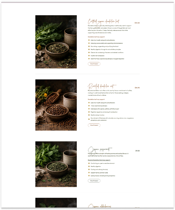
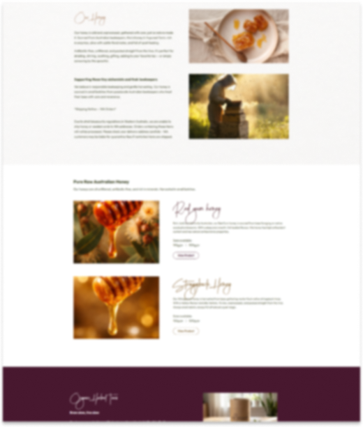
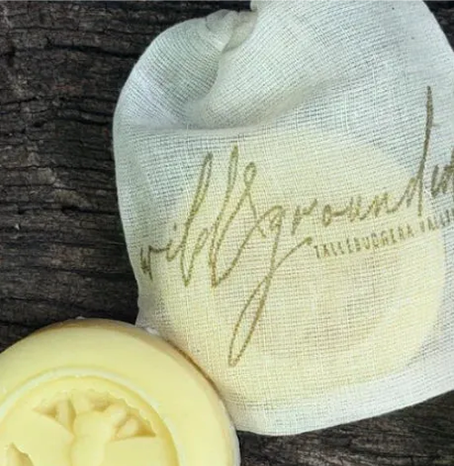
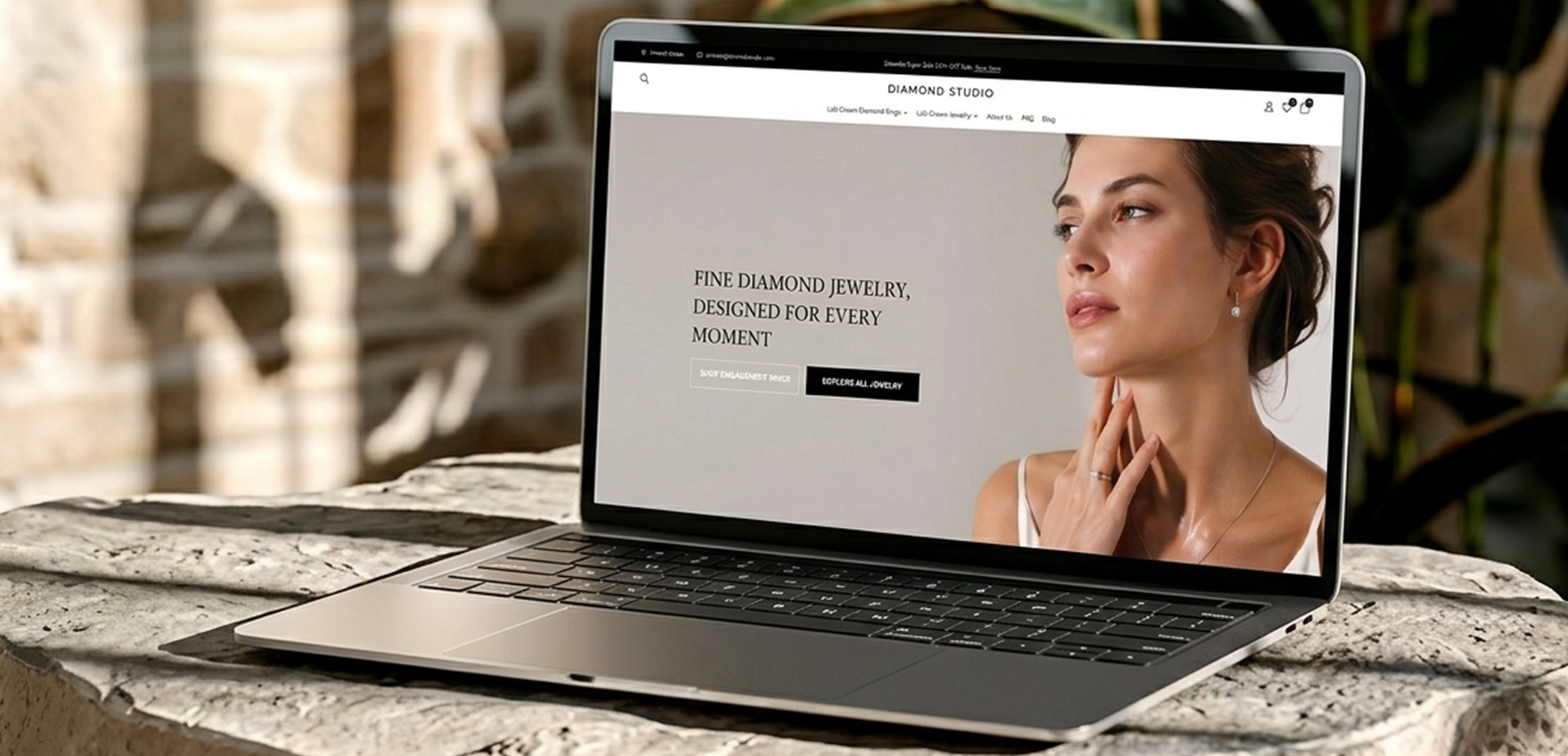
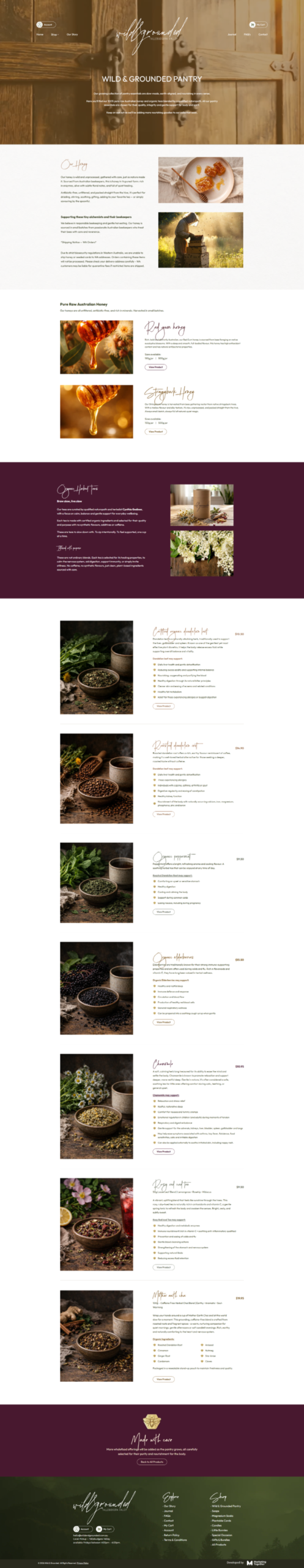
This collection page is structured to present products in a clean, editorial-style layout that emphasizes quality and transparency. A strong hero banner introduces the category with clarity while maintaining visual consistency with the brand. The layout alternates between product highlights and informative sections, allowing users to understand sourcing, benefits, and use cases alongside browsing. Each product block is designed with a balance of imagery and descriptive content, reducing reliance on quick decisions and instead encouraging informed purchases. Ingredient transparency and sourcing details are positioned as key trust drivers. Visual hierarchy ensures that pricing, product names, and CTAs remain easily scannable. The overall structure avoids clutter while still delivering depth, creating a browsing experience that feels intentional, calm, and premium.
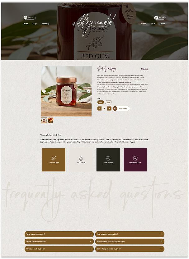
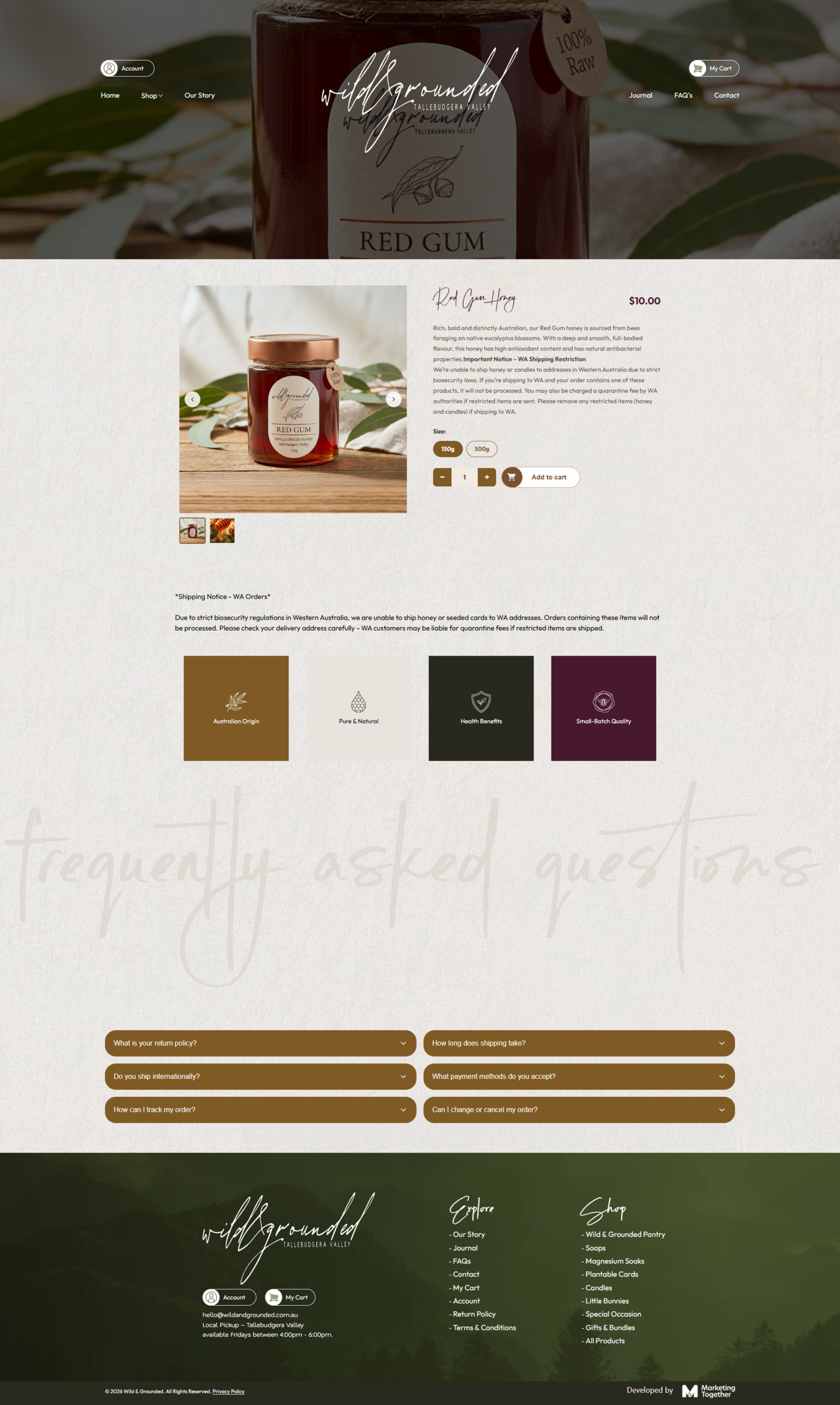
This shop page is designed with a clean catalog-first structure that prioritizes browsing clarity while preserving the brand's soft visual identity. A focused hero section introduces the collection with strong lifestyle imagery and concise messaging that sets expectations immediately. The grid layout presents products in a highly scannable format, allowing users to explore a large catalog without feeling overwhelmed. Consistent image ratios and spacing create rhythm across the page while maintaining a premium presentation. Product cards are intentionally minimal, keeping attention on imagery and product names for a distraction-free shopping experience. The structure supports easy navigation between categories while encouraging deeper exploration through visual variety. Generous whitespace and muted backgrounds help maintain readability across the extensive product range.

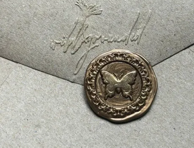
This brand story page is structured to deepen emotional connection through immersive storytelling and intentional visual pacing. A cinematic hero section establishes the tone immediately, supported by minimal copy and a focused CTA that encourages continued exploration. The layout alternates between narrative-driven content and rich lifestyle imagery to create a balanced reading experience that feels personal and authentic. Founder messaging is positioned prominently to humanize the brand and strengthen trust through transparency and emotion. Supporting sections communicate philosophy, sustainability, and sourcing practices without feeling overly corporate or dense.
This contact page is designed to feel calm, approachable, and aligned with the brand’s nature-led identity while keeping communication effortless. A soft hero section immediately creates emotional connection through immersive imagery and minimal messaging. The contact form is positioned beside lifestyle visuals to balance functionality with storytelling, making the interaction feel personal rather than transactional. Form fields are intentionally simplified to reduce friction and encourage inquiries without overwhelming users. Supporting pickup and shipping information is presented clearly to answer common logistical questions upfront. Subtle illustrations and organic textures reinforce the handcrafted feel throughout the page. The layout maintains strong readability while preserving the brand’s soft aesthetic. The overall experience blends accessibility, warmth, and clarity into a seamless support-focused flow.